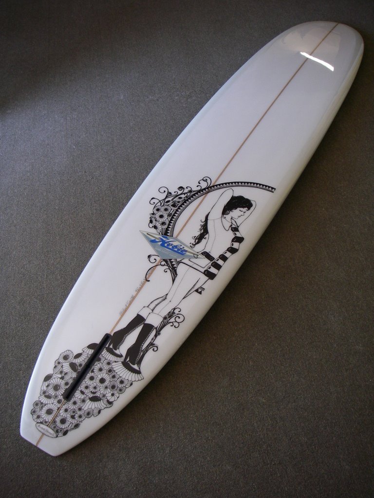
Good stuff. The overlap in her right arm is off and the face feels pulled out of perspective. The design seems a little small given the size of the board -it’s too 50/50 (design/empty space). For this kind of design it might be worth looking at Alfonse Mucha for some inspiration. Overall though a great look.
If it looks good….IT”S GOOD. The problem with some learned “artists” is the “rules”. There are none. If it looks good it’s good. Although, beauty is in the eye of…..ya know. I feel for someone whose eyes can’t simplify, and see the beauty of a piece even in the flaws.(if there are any) Oh well, what is beauty to me, may not be to you. It’s nice to be free and able to have an opinion. (while it lasts) SAVE THE NET!!!!!
I agree with the beauty/beholder thing but every artist worth their salt will look for improvements and input. To say all art is good might be a bit drastic but if the owner likes it, that’s what counts. Power to anyone who posts their work for others to see. When I get my stuff looked at I want feedback so that I improve. Just like surfing skills but it’s still fun and it’s all in good fun in the end.
…anonimous, well, personally I dont have this point of view about too much blank space…some years ago, I painted some boards in those “different” places..I dont see nothing wrong; its really cool..
-yeah may be you re right about the face or whatever, but not for the design s place..
I did not mean to say all art is good, in fact most of it that has been named “art” is usually crap. My main point is that there is too much focus on the rules and regulations or boundries which takes all the soul out of the piece. This is a problem in areas more than art! Too much book learn’n, not enough life liv’in. Be wary of telling all to show their work. Being in the arts (as you must be)you should know not to encourage the lame. Just go down to Laguna art fair and see how many seascape oils it takes to vomit. And to keep improving should be a given, in life. God, I feel lame even say’in it. epilougue: 90% of all of it out there sucks, in my opinion. end……


reverb
June 23, 2006…the outline looks superb…
…the artwork is fantastic and was done in a perfect place of the board…
Patch
June 23, 2006Very clean.
billy
June 23, 2006yes, but why put the Hobie logo in the middle of the drawing?
rob70
June 23, 2006Nice style. Reminds me of Klimt.
Anonymous
June 23, 2006Good stuff. The overlap in her right arm is off and the face feels pulled out of perspective. The design seems a little small given the size of the board -it’s too 50/50 (design/empty space). For this kind of design it might be worth looking at Alfonse Mucha for some inspiration. Overall though a great look.
warm jet
June 24, 2006If it looks good….IT”S GOOD.
The problem with some learned “artists” is the “rules”.
There are none.
If it looks good it’s good.
Although, beauty is in the eye of…..ya know.
I feel for someone whose eyes can’t
simplify, and see the beauty of a piece even in the flaws.(if there are any)
Oh well, what is beauty to me, may not be to you.
It’s nice to be free and able to have an opinion. (while it lasts)
SAVE THE NET!!!!!
Anonymous
June 24, 2006I agree with the beauty/beholder thing but every artist worth their salt will look for improvements and input. To say all art is good might be a bit drastic but if the owner likes it, that’s what counts. Power to anyone who posts their work for others to see. When I get my stuff looked at I want feedback so that I improve. Just like surfing skills but it’s still fun and it’s all in good fun in the end.
reverb
June 24, 2006…anonimous,
well, personally I dont have this point of view about too much blank space…some years ago, I painted some boards in those “different” places..I dont see nothing wrong; its really cool..
-yeah may be you re right about the face or whatever, but not for the design s place..
J.P.
June 24, 2006Keep in mind the photos are shot at an angle and that Tyler is only 20 years old.
warm jet
June 24, 2006I did not mean to say all art is good,
in fact most of it that has been named “art” is usually crap.
My main point is that there is too much focus on the rules and regulations or boundries which takes all the soul out of the piece.
This is a problem in areas more than art!
Too much book learn’n, not enough life liv’in.
Be wary of telling all to show their work. Being in the arts (as you must be)you should know not to encourage
the lame. Just go down to Laguna art fair and see how many seascape oils it takes to vomit.
And to keep improving should be a given, in life.
God, I feel lame even say’in it.
epilougue:
90% of all of it out there sucks, in my opinion.
end……
warm jet
June 24, 2006and in conclusion, I think the composition, technique, and feel of
this and other of Tyler’s work shown
is 100% bitchen!
billy
June 24, 2006I still think the logo should be in the white space.
As for the drawing, good job Tyler.
Surfsister
June 25, 2006Pickle did that? Why doesn’t Longboard Mag every show this side of him?